
Now that the "freemium" pricing model has become a dominant strategy for many companies, one of the greatest challenges is directing free app users to a premium paid subscription.
This article is based on notes from the course Machine Learning Practical: 6 Real-World Applications and is organized as follows:
- Defining the Business Objective
- Defining the Data Source
- Exploratory Data Analysis
- Building our Machine Learning Model
1. Defining the Business Objective
In this project, the target audience is the users that have downloaded the free app and the goal is to predict which users are not likely to subscribe to the premium subscription.
Since these users have already taken the first step and downloaded the app it makes sense to focus your marketing efforts on converting them.
Also, by identifying the users who are likely to convert to the premium version anyways it makes sense to not spend your marketing efforts on them.
Stay up to date with AI
2. Defining the Data Source
The data for this article is manufactured as this data is often proprietary and is meant to serve as a good representation of the real world. That said, the data we'll use for this case study is based on the customer behaviour within the app, including:
- Date and time of installation
- List of screens the user looked at
- Features the user engaged with
- Whether or not they played the mini-game
The app usage data is only for the first 24-hour period as during this time they have access the premium features. After the trial ends the company wants to be able to predict who isn't likely to convert so they can target them with special offers.
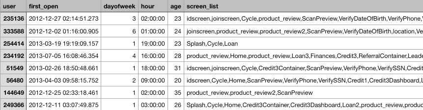
A screenshot of the dataset we'll be working with can be seen below:
3. Exploratory Data Analysis
For this project we'll use Google Colab and the first step is import the libraries we need and upload the dataset to our notebook as follows:
# import libraries
import pandas as pd
import numpy as np
import matplotlib.pyplot as plt
import seaborn as sns
from dateutil import parser
import time
# upload dataset
from google.colab import files
uploaded = files.upload()# read in csv with Pandas
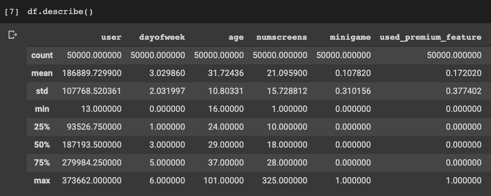
df = pd.read_csv('appdata10.csv')Now let's take a look at the dataset with df.describe():
The next step is to convert the hour data from a string, slice it, and convert it to an integer as follows:
# clean data
df['hour'] = df.hour.str.slice(1,3).astype(int)
Now let's create a dataset that just has the columns that we want to visualize.
To do this we create a copy of the original dataset and force drop the columns that we don't want as follows:
# drop columns for plotting
df2 = df.copy().drop(columns = ['user', 'screen_list', 'enrolled_date', 'first_open','enrolled'])
Plotting Histograms
Now let's create a histogram with our updated dataset as follows:
# plot histograms
plt.suptitle('Histograms of Columns', fontsize=20)
for i in range(1, df2.shape[1] + 1):
    plt.subplot(3, 3, i)
    f = plt.gca()
    f.set_title(df2.columns.values[i - 1])

    vals = np.size(df2.iloc[:, i - 1].unique())

    plt.hist(df2.iloc[:, i - 1], bins=vals, color='#3F5D7D')
plt.tight_layout(rect=[0, 0.03, 1, 0.95])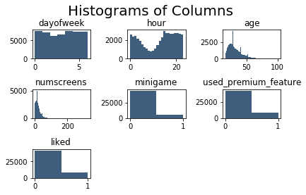
A few of the insights we can see from these histograms is that:
- The day of the week has quite an even distribution
- The hour does not have an even distribution, which can be attributed to the middle of the night for the primary markets
- Age has quite an even distribution although there are spikes for certain ages
- Number of screens has quite an even distribution with a few outliers
- Most people have not played the mini-game in the app
- Most people have used the premium features
- Most people have not used the "like" feature
Correlation Plot
Now let's do some more EDA with a correlation matrix of the numerical features.
The reason for this is that before building the model we want to have an understanding of how each independent feature affects the response variable.
We'll continue with our copy of the dataset and use the Pandas function .corrwith(), which returns a numerical list of the correlations between the variables in DataFrame.
In this case we'll give it the enrolled response variable and plot it with a bar plot as follows:
# correlation plot
df2.corrwith(df.enrolled).plot.bar(figsize=(10,10),
                                   title='Correlation with Response Variable',
                                   fontsize=15, rot=45,
                                   grid = True)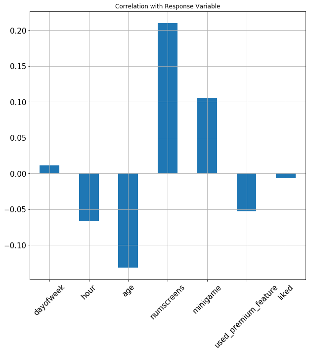
From this plot a few of the insights we can see include:
- Hour of the day is negatively correlated, meaning users are more likely to subscribe earlier in the day
- Age is negatively correlated meaning younger people are more likely to subscribe
- The number of screens a user views is strongly correlated with subscribing
- If a user plays the mini-game they're more likely to enroll
- Surprisingly, using the premium features is negatively correlated with enrolment
Correlation Matrix
Now let's build a correlation matrix, which gives us the correlation between each individual variable instead of with the response variable.
This will inform us which variables may be linearly dependant on each and will help us in the model building process.
We won't cover all the code for the correlation matrix in this article, but you can see the final matrix below:
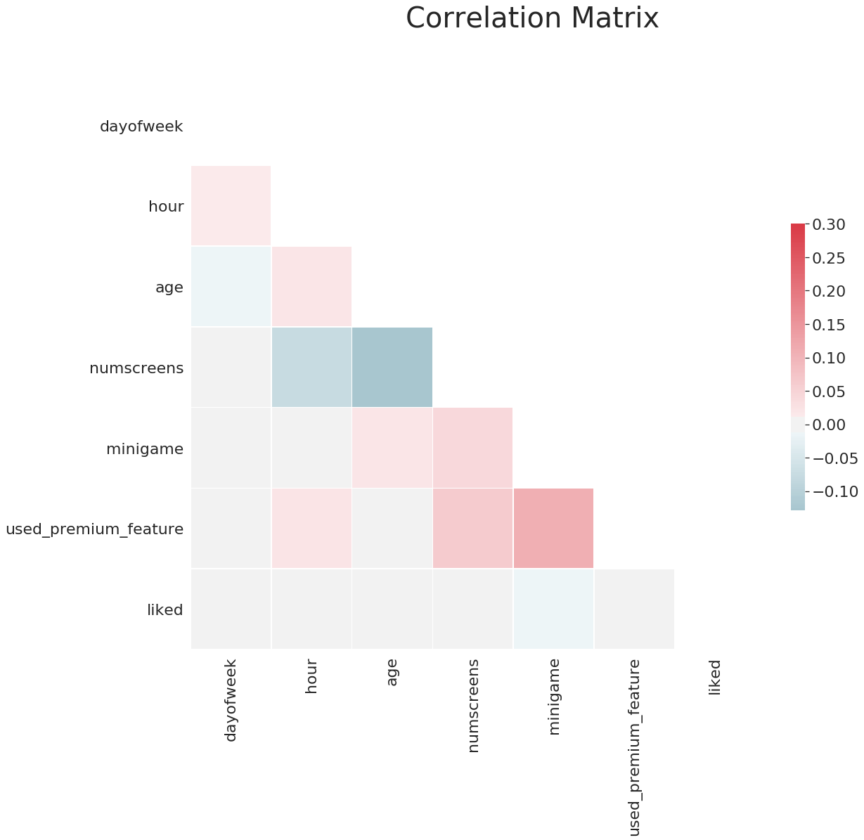
A few of the insights from this correlation matrix include:
- Age and the number of screens are strongly negatively correlated, so as age increases they look at less screens
- There is a strong positive correlation between playing the mini-game and using premium features
4. Building our Machine Learning Model
First let's start with the feature engineering process in order to build a machine learning model.
Feature Engineering - Response
The main part of feature engineering that we want to fine-tune is the response variable.
The reason this variable is important is that often we set a limit on when a user should convert to a paid subscriber as we want to be able to validate our model for future datasets.
For example, if we have a time limit of 7 days to convert from free to paid then we only have to wait 7 days to validate if the model worked or not.
In order to get the optimal time limit to set we'll plot the hour distributions between first_open date and the enrolled_date, and we need to some feature engineering to accomplish this.
First, let's take a look at the datatypes of our variables with the .dtypes attribute:
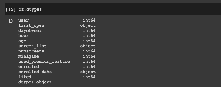
We can see the our two variables of interest are objects, and we want to convert these to into datetime objects.
To do this we're going to parse each date in the column and convert it to a datetime object as follows:
# convert first_open
df["first_open"] = [parser.parse(row_data) for row_data in df["first_open"]]

# convert enrolled_date
df["enrolled_date"] = [parser.parse(row_data) if isinstance(row_data,str) else row_data for row_data in df["enrolled_date"]]
Now if we check the datatype we can see these variables are datetime objects.
Next let's create a new dataset with the difference in hours between the two variables as follows:
# difference in hours
df["difference"] = (df.enrolled_date - df.first_open).astype('timedelta64[h]')
Now we can plot the distribution to see which hour is the best to use as a cutoff time for the response variable.
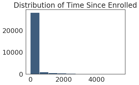
From this we can see that majority of people subscribe within the first 500 hours or so, but since it is so right tailed we will set a range to 100 hours to see if it is much less than that:
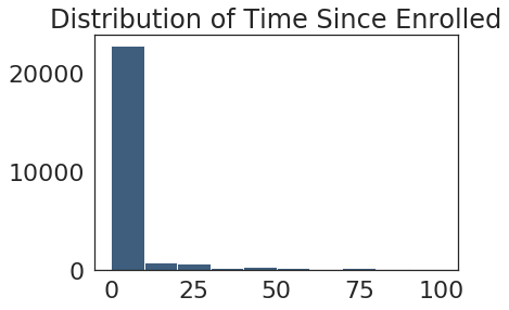
Now we can see the conversions really all happen within first 48 hours or so, so we will set 48 hours as our cutoff as follows:
# set cutoff to 48 hours
df.loc[df.difference > 48, 'enrolled'] = 0
This means that if they enroll after the the 48 hours cutoff we set the enrollment to 0 so we won't count it. Now we can also drop the columns that we don't need anymore as follows:
# drop columns we don't need anymore
df = df.drop(columns = ['difference', 'enrolled_date', 'first_open'])
Feature Engineering - Screen List
Now let's apply feature engineering to the screen list, which is a CSV that tells us the screens visited within a 24 hour period.
To use this in our model we need to convert it to a format it can read. In particular, we need to make each screen it's own column.
Since there are so many screens, however, we are just going to take the top screens and apply feature engineering to them.
First let's read in the CSV to our notebook and create columns for the only the most popular screens.
To do this we will map each of the screens by separating them from the string into their own list of vectors as follows:
df['screen_list'] = df.screen_list.astype(str) + ','for sc in top_screens:
df[sc] = df.screen_list.str.contains(sc).astype(int)
df['screen_list'] = df.screen_list.str.replace(sc+',', '')To get value out of the screens that aren't in the most popular list we'll create a final column called "Other", which will tell us how many leftover screens we have:
df["Other"] = df.screen_list.str.count(",")Now that we have done this feature engineering we have no need for the screen_list columns so we will drop it from our dataset.
The final thing we need to do for feature engineering is to identify the funnels, which are a group of screens that belong to the same set. In other words, these are correlated screens that we don't want in our model.
In order to get rid of this correlation between screens in a funnel but still be able to get value from them we will group all those screens into one funnel.
So if the screens are part of a funnel they will be in one column with the number of screens in the funnel, which will ultimately remove the correlation but still keep the data.
For example, in this app there is a funnel related to savings so we will put them all into one column:
savings_screens = ["Saving1",
                    "Saving2",
                    "Saving2Amount",
                    "Saving4",
                    "Saving5",
                    "Saving6",
                    "Saving7",
                    "Saving8",
                    "Saving9",
                    "Saving10"]
Next we will add the count all the savings columns and add it to our dataset as follows:
df['savings_count'] = df[savings_screens].sum(axis=1)Now we can drop all the savings_screens columns from our dataset.
There are multiple funnels in this dataset, so we're going to repeat this process for all of them. Below you can see all of the columns that we're left with:
Now that we've got all the screens that matter and aggregated the funnels, we're ready to build our model.
4. Building our Machine Learning Model
In order to build our machine learning model we still need to do some data preprocessing for our new dataset.
Data Preprocessing
The first thing we're going to do is split the response variable from the independent features, and then remove the response variable from the original dataset as follows:
# data preprocessing
response = df['enrolled']
df = df.drop(columns = 'enrolled')
Now we need to split the dataset into 80% training and 20% testing sets as follows:
from sklearn.model_selection import train_test_splitX_train, X_test, y_train, y_test = train_test_split(df, response,
test_size=0.2,
random_state = 0)Since we still have the user column in our dataset and it's not a feature we're going to remove it, although keep in mind that we want to associate our final prediction with a user so we'll save it elsewhere first:
train_indentifier = X_train['user']
X_train = X_train.drop(columns='user')
test_identifier = X_test['user']
X_test = X_test.drop(columns='user')
The next step is feature scaling, which we'll get from sklearn as follows:
from sklearn.preprocessing import StandardScalersc_X = StandardScaler()The StandardScaler returns a Numpy array of multiple dimensions, although it loses the column names and the index so we're going to save the scaled part into a different DataFrame as follows:
X_train2 = pd.DataFrame(sc_X.fit_transform(X_train))
X_test2 = pd.DataFrame(sc_X.transform(X_test))
Now let's make sure the scaled dataset has the columns that we want:
X_train2.columns = X_train.columns.values
X_test2.columns = X_test.columns.values
Next we need to recover the indices from the original training dataset as follows:
X_train2.index = X_train.index.values
X_test2.index = X_test.index.values
The final data preprocessing step is to convert the original training and testing sets into the new sets:
X_train = X_train2
X_test = X_test2
Now that we've scaled the training and testing set all of the features have been normalized we're ready to build our machine learning model.
Model Building
In this section we'll train the classifier on our preprocessed data.
First we will import the logistic regression classifier from sklearn:
from sklearn.linear_model import LogisticRegression
Next we'll create our classifier and add a penalty of L1, which will change the model from a regular logistic regression model to a L1 regularization model.
classifier = LogisticRegression(random_state = 0, penalty = 'l1', solver='liblinear')
The reason we do this is that, as we saw in the EDA section, screens can be correlated to each other. We addressed some of this correlation with by aggregating funnels, but there may be other correlations between the screens.
The L1 regularization solves this by penalizing any field that is strongly correlated to the response variable.
Next we will fit the classifier to X_train and y_train as follows:
classifier.fit(X_train, y_train)Now we can make predictions with X_test:
y_pred = classifier.predict(X_test)Next we will evaluate if the predictions were accurate with the following metrics:
from sklearn.metrics import confusion_matrix, accuracy_score, f1_score, precision_score, recall_scoreFirst let's look at the accuracy score of the model:
accuracy = accuracy_score(y_test, y_pred)Here we can see we get an accuracy score of 76%, which is quite a strong starting point for the model.
Next we'll look at the precision (true positives / (true positives + false positives):
precision = precision_score(y_test, y_pred)We can see we get 76% again, which is a good sign.
Next we'll use to the recall score (true positives / (true positives + false negatives)). Here we get 77% which is again quite good.
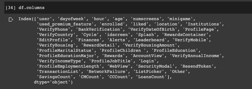
Finally, we we will plot the confusion matrix, which is a table that gives us the number of predicted values and the number of real values:
Next we'll use k-fold cross validation to make sure we're not overfitting, which is a technique that applies the model to different subsets of the training sets.
from sklearn.model_selection import cross_val_score
accuracies = cross_val_score(estimator=classifier, X=X_train, y=y_train, cv=10)
After running our k-fold cross validation we see the accuracy is consistently between 76-77%.
Model Conclusion
Now let's combine our predicted results, the actual results, and the identity of the users.
To do this we want to build a dataset with these 3 features as follows:
final_results = pd.concat([y_test, test_identifier], axis=1).dropna()final_results['predicted_result'] = y_predfinal_results[['user', 'enrolled', 'predicted_result']].reset_index(drop=True)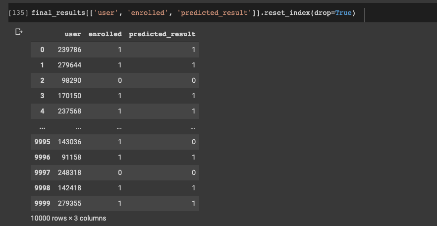
From these 10 results we can see only 1 was incorrect.
Summary: Machine Learning for Paid Subscriptions
In this project we saw how to build a machine learning a model that achieved ~77% accuracy in predicting whether app users will enroll in the paid subscription or not.
The goal of this prediction was so that we can allocate more marketing resources to the users who are less likely to convert, and thus increase subscription rate.
As discussed, a model like this is extremely useful for companies that employ the freemium pricing strategy.


